

Rooq Cafe Logo & Menu Publication
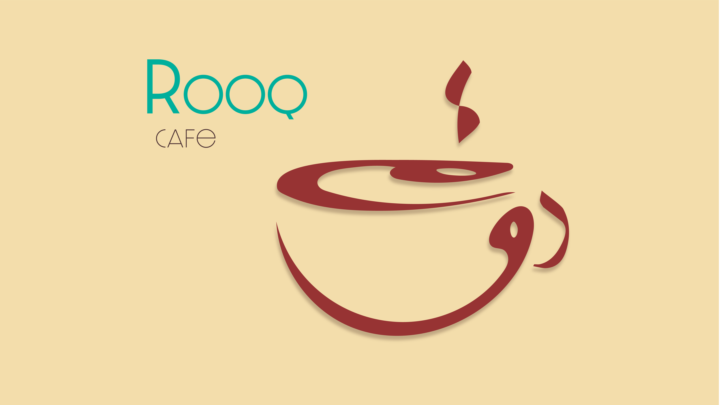
This menu I had designed I wanted to use a relationship between two different languages. Being Arabic and English. I designed the logo using the three letters in Arabic that make up the name of the café. I wanted to symbolize it using an abstract way that represents a cup of tea or a cup of coffee. I feel like the form has attributed to that. Even the two dots on top of the cup reflecting there. ROOQ is the name of the café translated in Arabic it means to just calm down or relax. That in mind I thought it would be in correlation to make this the way I did as a cup of tea or a cup of coffee that is relaxing and calming.

I have multiple pages bound to a piece of Birchwood.I have these pages bound using clips on the board, I figured that it would be easier if the pages would be removable to flip through them. But that was just an idea and it’s possible to change.